24 mai 2024
The Next.js <Image> Component
9 minutes de lecture

Images have become essential elements of a website, greatly enhancing user experience. However, implemented poorly, they can also slow down page loading times, negatively impact your SEO, and degrade user experience.
That's why the Next.js framework offers its <Image> component, an extension of the HTML <img> element that enforces the best possible implementation of our images.
The purpose of this article is to clearly explain the role and sometimes misunderstood operation of this component.
It will be divided into three parts:
- The advantages provided by
<Image>. - How does
<Image>work? - Finally, examples of common use.
Since version 13, major changes have been introduced to this component. This article will discuss <Image> only for versions next@13.0.0 and above.
What benefits does <Image> bring?
Before diving into the details of how this component works, it's important to understand its advantages.
Many of the optimizations provided by Next.js's <Image> component are merely an abstraction of the HTML <img> element API. But some features take advantage of the capabilities of the Next.js meta-framework.
In essence, <Image> operates under 3 aspects to improve the images on your website.
1. SEO Friendly Implementation
Whether it's accessibility (with the mandatory use of the alt property) or other aspects such as optimizing Cumulative Layout Shift (CLS), the <Image> component enforces a strict and rigorous implementation of images.
2. Optimized and Responsive Images
Thanks to its client/server infrastructure, Next.js generates various sizes and formats to serve the most suitable image to the user.
If the browser supports it, a modern format will be delivered (such as WebP). Different dimensions of images will be made available to <img> via the srcset property.
3. Smart Loading
By default, all your images will only be loaded if they are visible in the browser's viewport, to reduce the weight of media downloaded during the initial page load (via the native loading attribute).
These are promising features, but how do you use <Image> to get the most out of it?
II. How Does <Image> Work?
To explain <Image> API and its operation, I'll need to rely on the most commonly used properties. It's a non-exhaustive list so you better understand its usage, but you can find the complete list of properties here.
src
Property representing either a path to an image (internal or external) or a statically imported image.
import Image from 'next/image'
import someStaticImage from './image.png'

function StaticImage() {
  return <Image src={profilePic} />
}

function ExternalImage() {
  return <Image src="https://example.com/image.png" />
}

function InternalImage() {
  return <Image src="/image.png" />
}
For external images, it will be necessary to authorize the domain in the .nextconfig.js file via the remotePattern property. Since Next.js exposes a public API endpoint to optimize image sizes (e.g., .../_next/image?url=/logo.png&w=100&h=100&q=70), malicious individuals could use your server to optimize their images. Therefore, it is necessary to restrict access to trusted domains.
alt
Used to describe the image to screen readers and search engines to improve accessibility, this property is mandatory with <Image>. No more excuses for forgetting the alternative text!
width / height
Defines the width and height of the rendered image on the page in pixels.
If it is not possible to know these values or they are dynamic you can use the fill property (see below).
It is mandatory to define these properties unless you use static images (they will be automatically completed) or if you use the fill property.
One of the main reasons for the existence of these properties is to optimize Cumulative Layout Shift (CLS).
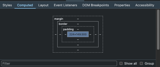
If you don't yet know the dimensions of your rendered image on the page, apply your style without worrying about these properties. Once you have defined your style, use your browser's inspector to obtain the dimensions of the rendered image in the "Computed" tab of the devtool.

fill
Boolean indicating whether the image should completely fill the parent container. Useful when the width or height of the image is unknown.
If you opt for this mode, your <img> element will be switched to position: absolute; and style will be applied so that it can fully cover the parent element. It will be necessary to add position: "relative", position: "fixed", or position: "absolute" to the parent. And in some cases, it will also be preferable to add object-fit: "contain" or object-fit: "cover” to the image element, depending on the desired rendering.
sizes
A string, similar to a media query, that provides information on the width of the image at different breakpoints.
Perhaps one of the most misunderstood properties of the <Image> component, yet it greatly affects performance (it is not specific to Next.js).
In short, coupled with the srcset property, this value will define which size of the image should be downloaded by the browser. Fortunately for us, the srcset property is automatically managed by <Image>.
How does it work?
When the browser downloads and then reads the HTML containing your <img> tag, it has not yet loaded the style and therefore does not know the size your image will take in the viewport.
To know this information, it refers to the sizes property, which specifies what size our image will be depending on the viewport width.
Based on this, it knows which image size to download.
If you do not define this property and use fill, Next.js will automatically set a default value of 100vw and a wide list of srcset will be generated (640w/750w/etc..).
If you do not set this property without using fill, then a very small list of srcset will be generated (x1/x2/etc).
It is recommended to define this property to improve your site's performance, especially for
images using fill or images that are "responsive".
To better understand, here's an example of Next.js code with an image of 7360 x 4912 pixels.
import Image from 'next/image'
import src from '../../public/desert.png' // 7360 x 4912 pixels

export default function Home() {
  return (
    <main className="flex justify-center items-center">
      <Image
        alt="desert"
        className="md:w-40 w-screen"
        src={src}
        placeholder="blur"
        sizes="(max-width: 768px) 100vw, 160px"
      />
    </main>
  )
}
I have set the sizes property to (max-width: 768px) 100vw, 160px. Therefore, Next.js will generate a srcset with different sizes of images.
From the browser's side, this will result in this HTML code.
<main className="flex justify-center items-center">
  <img
    alt="desert"
    width="7360"
    height="4912"
    class="md:w-40 w-screen"
    sizes="(max-width: 768px) 100vw, 160px"
    srcset="
      /_next/image?[...].jpeg&w=640&q=75   640w,
      /_next/image?[...].jpeg&w=750&q=75   750w,
      /_next/image?[...].jpeg&w=828&q=75   828w,
      /_next/image?[...].jpeg&w=1080&q=75 1080w,
      /_next/image?[...].jpeg&w=1200&q=75 1200w,
      /_next/image?[...].jpeg&w=1920&q=75 1920w,
      /_next/image?[...].jpeg&w=2048&q=75 2048w,
      /_next/image?[...].jpeg&w=3840&q=75 3840w
    "
    src="/_next/image?[...].jpeg&w=3840&q=75"
  />
</main>
- If the viewport is larger than 768px wide: it's the 640w size from the
srcset(the one closest to 160px) that will be downloaded. - Otherwise: the browser will download the size closest to the viewport (100vw).
Without this optimization, the original image (7360 x 4912) would have been loaded without distinction (or almost ⬇️)
The most observant among you will have noticed that the size of the image in src (w=3840) is
not the original size (7360px). This is an optimization from Next.js that considers the maximum
size of a user's viewport to be 3840px. This option is configurable in your configuration
file.
placeholder
String that will be used while the image is loading. Possible values are
empty: Default value, no placeholder.blur: If the image is a static image the blur works "out-of-the-box" and a low-quality blurred version of the image will be used while loading. Otherwise, you must also specify theblurDataproperty to define the low-quality image (base64).data:image/…: To use a data URL while the image loads.
III. Examples of common usage
I'd like to show you two practical cases to help you better understand this component. For these examples, I will use TailwindCSS to simplify the readability of the code.
- Static Background Image
- Dynamic Image Gallery
1. Static Background Image
Here are links to the demo and the source code.
In this example, we will create a background image (with a slight filter) that will cover the entire screen.
I use the fill property so that the image covers the entire screen.
As the image is in position: absolute;, I won't have a detrimental effect on Cumulative Layout Shift (CLS), but it will be necessary to add a parent element with a relative position.
import Image from 'next/image'
import src from '../../../public/arrakis.jpeg'

export default function Home() {
  return (
    <section className="relative w-screen h-screen flex justify-center items-center overflow-hidden">
      <h1 className="relative z-30 text-4xl sm:text-8xl text-center">Welcome to Arrakis</h1>
      <div className="absolute w-full h-full z-20 top-0 left-0 bottom-0 right-0 bg-black/10" />
      <div className="absolute w-full h-full z-10 top-0 left-0 bottom-0 right-0 overflow-hidden">
        <Image src={src} alt="desert" placeholder="blur" fill className="object-cover" />
      </div>
    </section>
  )
}
I'm using a static image, so the blur is implemented by Next.js. I don't need to add the
blurData property to define the low-quality image.
2. Dynamic Image Gallery
You can find the demo here and the source code here.
In this example, we're going to create a responsive image gallery in a grid.
Here's our <Grid> component that will display the images.
function Grid({ children }) {
  return (
    <section className="grid grid-cols-1 sm:grid-cols-2 md:grid-cols-3 lg:grid-cols-4 gap-6 px-4 py-8 md:px-6 md:py-12">
      {children}
    </section>
  )
}
For those who might not be familiar with TailwindCSS, here's a brief summary of the applied style:
- For
smsize screens (< 640px), the grid will have one column. - For
mdsize screens (< 768px), the grid will have two columns. - For
lgsize screens (< 1024px), the grid will have three columns. - For
xlsize screens (>= 1024px), the grid will have four columns.
Next, we will create a <Card> component that will display an image (as well as a title and a description).
function Card({ src, alt, title, description }) {
  return (
    <div className="bg-white rounded-lg overflow-hidden shadow-md dark:bg-gray-950">
      <div className="w-full h-48 xl:h-72 relative">
        <Image
          alt={alt}
          className="object-cover"
          fill
          src={src}
          sizes="(max-width: 640px) 100vw, (max-width: 768px) 50vw, (max-width: 1024px) 33vw, 25vw"
        />
      </div>
      <div className="p-4">
        <h3 className="text-lg font-semibold mb-2">{title}</h3>
        <p className="text-gray-500 dark:text-gray-400">{description}</p>
      </div>
    </div>
  )
}
I want to use the fill property because my images are dynamic and I don't know their sizes.
For performance reasons mentioned earlier, I've defined the sizes property so the browser knows which image size to download based on the viewport width.
I refer to my <Grid> container component to set the size of my images according to the viewport width:
- For
smsize screens (< 640px), the image size will be 100% of the viewport width. - For
mdsize screens (< 768px), the image size will be 50% of the viewport width. - For
lgsize screens (< 1024px), the image size will be 33% of the viewport width. - For
xlsize screens (>= 1024px), the image size will be 25% of the viewport width.
Conclusion
The <Image> component requires us to implement our images rigorously but optimally. It simplifies image management by deploying a variety of techniques to improve the performance and accessibility of your website.
In the vast majority of cases, <Image> is the wisest choice for implementing your images in a Next.js project. But if you have specific needs or constraints, it's always possible to use the classic HTML <img> element.
As a general addendum, if you're encountering performance issues with your images and already using <Image>, the sizes property is often a good first place to look.